9.16.2017

Class Review: Dynamic Sketching 1 with Peter Han at CGMA

Earlier this year I took the Dynamic Sketching 1 Class at CGMA with Peter Han and would like to share my experience just in case anyone out there is looking to take the class too.

Expectations for Class: Drawing was feeling rusty and was hesitating every time I would put my pencil to paper, so wanted a class to kick off better habits and overall just draw more confidently.


Week 1 - warm up exercises for drawing and material introduction

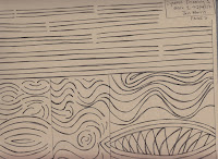
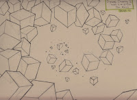
First class was all about the tools (pens), paper and learning how to use both. And NO pencils. I am used to drawing with pencil first and figure things out before inking, so I realized real quickly this class was going to challenge me in more ways than I had expected.

First exercise was repetition of straight lines, circles, and curves to start to build muscle memory and get used to the pens.


Week 2 - study of organic forms, contour lines and textures

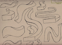
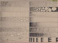
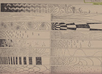
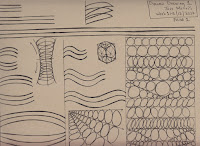
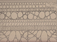
Next we practiced the same lines but by creating forms, both organic and rigid. Added interior lines to help define the volume of the shape and also learned to make the outer line thicker to help it stand out against surrounding shapes. Last part of this exercise was to slice the shape and use textures to help define how the inside looks.
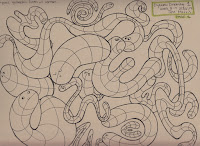
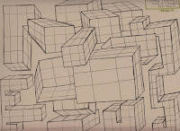


Week 3 - analysis of geometric forms, basic perspective and shadow studies

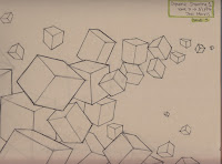
Putting lines down started to feel a bit more comfortable at this point while we practiced perspective. Coming up with textures was really fun and really challenged my pen techniques. Also this week we were shown how to use a light gray marker to lay the ground work and then go over with the black pen. This was kind of replicating how I usually would use a pencil first, but still had to really think and visualize what I wanted to draw before putting down lines since still can't erase.
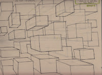
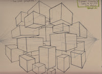
     

Week 4 - study of how previous five forms create and interrelationship to describe the subject matter with more line work

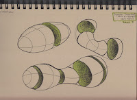
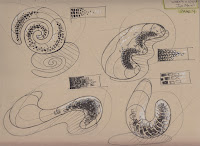
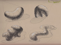
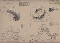
This is where everything we have done so far all started to come together. Organic forms, defined by texture/highlights and now started to add shadows to help it put in space.

I especially liked this exercise! It was very therapeutic to add the textures to the shapes, and since it was just a blob and not a character made it easier to focus on getting the form right.
  

Week 5 - use of markers and additional materials to create better sense of depth, volume, and textures

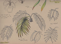
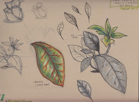
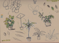
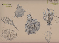
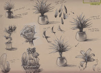
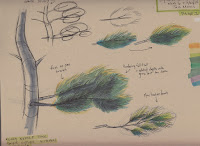
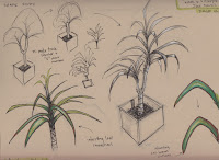
Now out of our heads and back to real life -- time to draw plants! It was a great next step putting all of our new skills to use. Peter really stressed this week about thinking of our sketchbook pages as our thoughts; figuring things out, simplifying, writing notes, and the like.

The process we went through for each drawing would go something like this:

- What is the basic shape? (thinking about simplifying the overall shape and pushing it to be more appealing) These drawings would be smaller.
- Once replicated the desired shape a bit larger with a gray tone marker, then would go in and start defining the plant. Is there an overall shape for the leaves or is it simple enough to do individual or bunches of leaves? How simply can things be defined without over complicating the plant? The goal is to communicate the idea of the plant, not render every detail.
- Next step is further defining the shape with the textures. The leaves for example can be rendered in a way to help define the depth of the bunch of leaves. Front/mid/back all have a different way of being rendered that will help with depth. It was a great challenge to explore different ways to render the leaves and try to find the simplest way to accomplish the look and feel I wanted.
- Heavier line around the outside to help define the shape and make it pop.
- Add highlights to where the light is hitting it the hottest!
 

Week 6 - drawing plants from observation at location

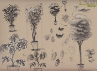
More plants! Same exercise, but now bringing in some color in. This demo of Peter's stood out to me because I have never seen anyone use markers like he does.

The idea of adding the color was to layer it onto what we were already doing, and NOT fully render it. I laid the color on a little to heavily for most of the plants bringing them more into the rendered zone. This was a difficult concept for me to grasp.
     

Week 7 - recap

Now on to the final assignment! Now taking everything we have learned and applying it to a character design.

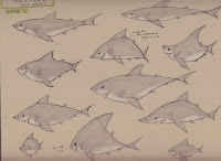
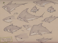
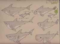
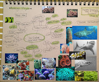
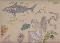
This is my shark, he is different from the other sharks. He's vegetarian, so lives mostly on seaweed and algae, which has tinted him green. The other sharks think he's a weirdo and aren't really sure what to think of him, so naturally they pick on and bully him. He has had to adapt to his situation and in order to survive he has to hide in the coral to go unseen. He has made many fish friends who help him do this.

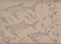
I had a lot of fun this week playing with shapes and ways to change the proportions to get different looks.
     

Week 8 - final

Pushed my favorite design further and explored other angles and expressions to further figure out who he is. The final character sheet and rendering was a lot of fun to do!


Thoughts on Class: There was a TON of drawing done in this class, what you see above isn't everything. So I really had to draw everyday to keep up with the assignments. This was a great practice to get back into. Early on I wasn't sure how much I was getting out of this class and though enjoyed the exercises, I was yearning to draw characters. I felt some improvement throughout, but it wasn't until I was finished with the class that I fully felt the benefits of everything we did. I was drawing so much faster and way more confidently! I also now prefer to get sketches down with pens instead of pencils, leading to better more appealing drawings. 

I also love that it was a MUST to draw on paper and didn't even have the option to draw digitally untl the very final piece. There really is something special that happens when you draw on paper that you just can't get on the smooth surface of a screen. It was great to hear Peter feels similarly. 

Peter Han is a fantastic instructor and I highly recommend this class for anyone that is looking to draw more confidently and learn a ton of techniques.

9.08.2014

Animating Quads

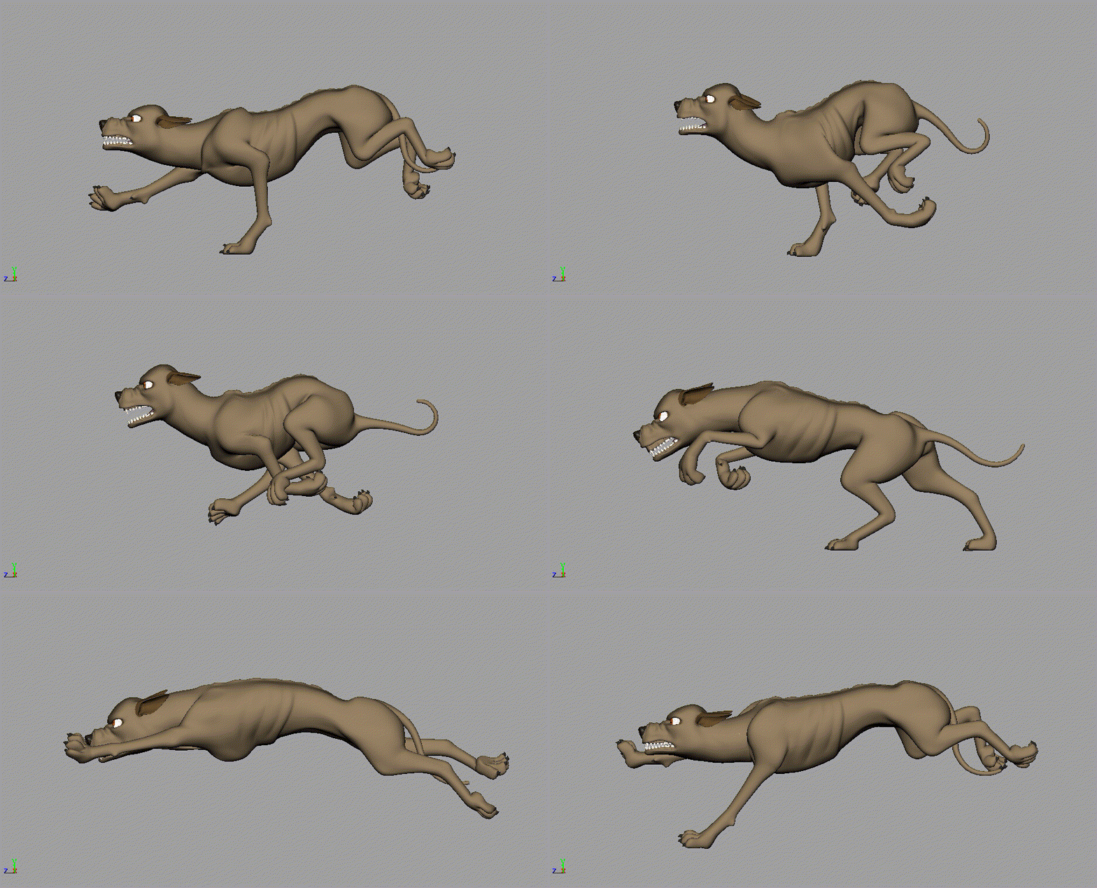
A couple years back I was Animating on Free Birds, and during that time I was the Quad Lead. I did some quad work on Cats & Dogs 2 and Twilight at Tippett Studio, so was excited to bring to the table what I learned from my friends over there. Along with that experience, there was a ton of research and discovery that went into figuring out how these four legged animals move, and I loved every minute of it!


Walk


Stalk


Trot


Flying Trot 


Canter


Gallop


Animating Quad TIPS!

(There is a lot of great broad information out there on animating quads, so I don't want to re-say what's already been said - and so well! So here are some random tips I have come across while animating quads.) 


- Reference Reference Reference! Find it, study it, use it! Making this stuff up might be faster, but its also the fast way street to unbelievable animation.
 
- If you use a cycle, bake it down, make the feet legit so they aren't sliding around - EVEN if there is grass covering them. YES sliding feet are felt even if you can't see them contacting the ground.

- Dirty up the cycle so you get variation in the movements, so it doesn't FEEL like a cycle. This pass is a lot of fun, because its what makes the animal start to feel believable! Think about what the animal is doing and how its surroundings will affect its movement.

- Simplify the anatomy and understand what is happening beneath all that fur! As a study, I suggest take some of your reference and draw the simplified skeleton over the animal in each frame. Once you hit play it should be more clear as to what is making the animal move and how.

- Scapula's! I feel like this is the secret ingredient for some really impressive quad animation. This is also what will give the animal weight. So it is a necessary component to their movement, but often missed. Cat's scapula's push up the most, dogs some, horses don't break the silhouette, but you still want to animate them since you will feel them sliding beneath the surface.

- Break the hips up from the chest so you don't get "sausage body".

 - Floppy ears will obviously have more overlap than pointy, but make sure on the pointy ears you aren't giving them too much overlap. There is cartilage going through them and wont feel believable if they are too floppy. Ears are another way to show thought process and personality! They can almost be like the brows, anticipating movements and showing internal thoughts.

- When you can't easily see the far eye, generally you want to point the nose towards where the animal is looking.

- The timing of the feet in the air versus on the ground. Roughly about 1/3. Most beginning animator key it 50/50. - Ryan Hood


Some of those awesome resources I was talking about...

- Animating Animals Pinterest
- Eadweard Muybridge Studies
- How to Draw Animals by Jack Ham
- The Art of Animal Drawing by Ken Hulgren
- Will Groebe Master Class: Animating Animals
- Animating Animals with FORCE with Michael Mattesi
-Real life!


And if you have tips of your own, please do share! I love this stuff!

3.19.2014

Schoolism: Stephen Silvers Character Design - Complete!

I just finished Stephen Silvers Character Design class through Schoolism! I learned a great amount from each of Stephen's lectures and especially from his draw-overs. It's amazing how he could make my design so much better with just a few alterations! I feel like my biggest improvements are my confidence in my line, drawing through the forms - making sure everything fits together, and pushing the shapes. I haven't gotten my final critique yet, so I'll find out soon what Stephen feels my biggest improvements are and what I should work on moving forward!

Lesson 1 we drew a character based on a description we were provided with. And Lesson 9 was the same assignment, but applying everything we learned throughout the class. Here is the comparison:


There are certain elements from the original I do still like, since it's more film type details, but I am really happy with the final character! He is definitely more solid and interesting... feels like he is actually leaning on the counter, has more character, pushed shapes - yeah! Much better!  I didn't spend as much time on his paint job as I wanted to, but I did the best I could with the time I had. I'll give more time to the next one!

If you want to see the other Lessons leading up to the 9th, continue on!

Lesson 2: Thinking, Looking, Doing.

This week was all about design fundamentals and the importance of silhouettes. The thing that really stuck was even with doing silhouettes, its still important to get the gesture and form down. Once I treated even my little silhouettes as more of a gesture, my shapes began to unflatten.

The long assignment of the class is designing a Jekyll and Hyde character. I decided to do a pig scientist that would turn into warthog. Here are the silhouettes I did exploring different design possibilities.


Lesson 3: Construction/Caricature

This week covered the importance of construction, what it means to avoid the ladder and tap into the realm of caricature. He gave great examples of design issues and how to avoid them. This was extremely helpful! So many things to think about and keep in mind that all make for a stronger design!

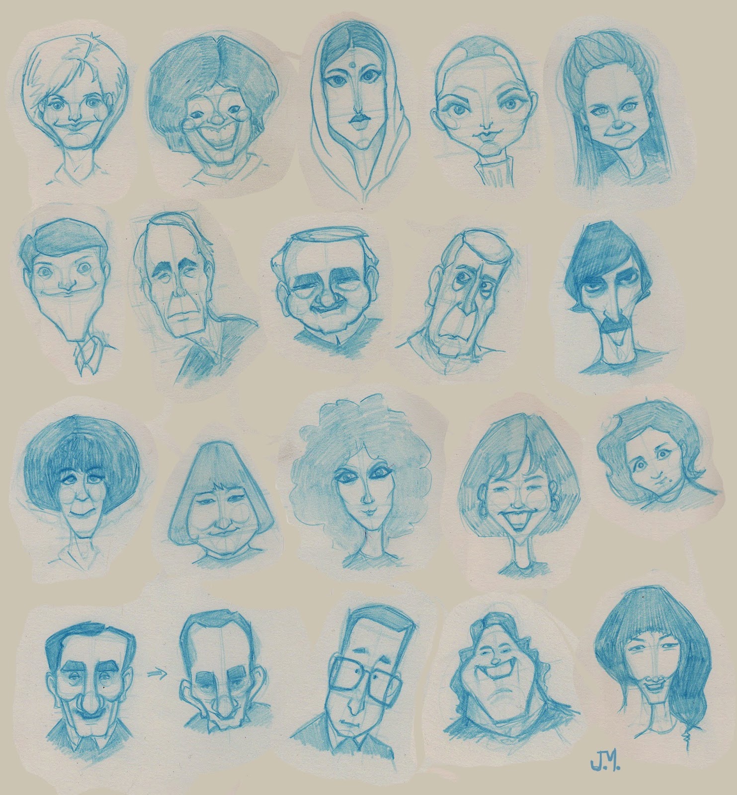
One part of the assignment was figuring out the construction of a bunch of heads and also tracing over faces to see their proportions and what makes them look the way they do.


Another part of the assignment this week was to do a drawing of this dude with an awesome stash and bowler hat.


Then I had to put the picture and drawing away and do characters based on his essence.


Also did a bunch of other caricatures...


And finally continued on with our Jekyll and Hyde assignment by adding more character, clothing and personality. I first did some pig and warthog studies to get familiar with the animals.


Lesson 4: The Features

Stephen had many great tips on how to break down the features to make them simple to draw from all angles and also how to push them in a way that still makes the characters believable. This weeks assignment was all about studying.


 Lesson 5: Clean-Up

This week Stephen demoed several different ways to clean up a drawing while focusing on scale and proportion. The idea of continuing to draw over your drawings again, then again... then again and as many times as you can to further explore and push was a huge thing I learned this week. It's so easy to get locked down on an idea which often leads to stiff boring drawings.

From this point we had to choose only Jekyll or Hyde to continue on with. I choose Dr. Jekyll, but I hope to finish off Hyde now that the class is over so I have the complete set.


Lesson 6: Turnarounds

I learned a lot of tricks to keep a character consistent while turning it around. Still tough though...


Lesson 7: Expressions and Attitudes

Stephen drew a range of expressions while focusing on rhythm, balance and flow. He also did a color demo that was extremely helpful. It's amazing how fast he can go from line art to a finished piece!

And here is the final part of the Jekyll assignment!


 Lesson 8: Memory sketching and how to approach keeping and drawing in a sketchbook daily.

I realized this week that this is what I have to work on the most. I have a really hard time drawing something if I don't have it in front of me while I am drawing it. I realize the more I do this the easier it will become. *pencil to forehead* Draw Draw Draw!


All in all this was an amazing class that I have obviously grown in and had a lot of fun in! I would highly recommend this class to anyone who is looking to improve their character design skills from an amazing teacher that is also a working professional! Thanks Stephen Silver for an amazing class and getting me drawing again!